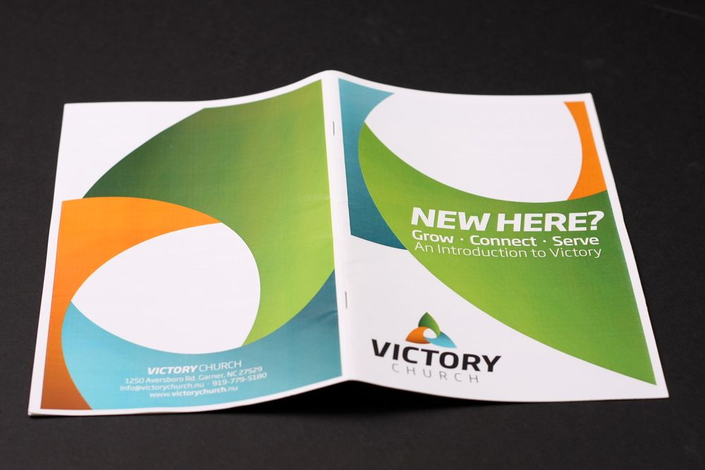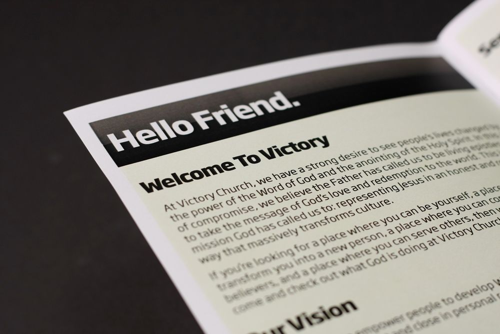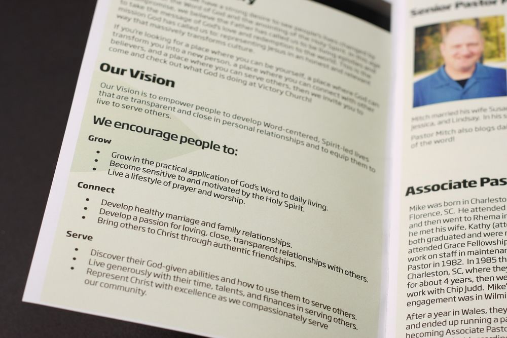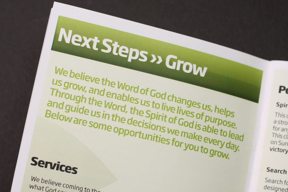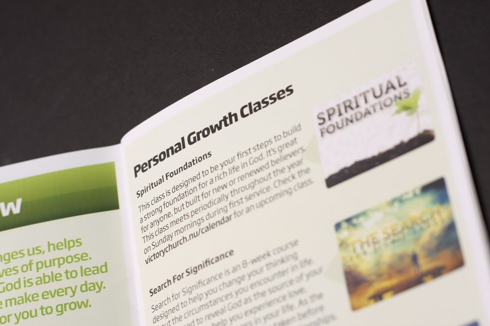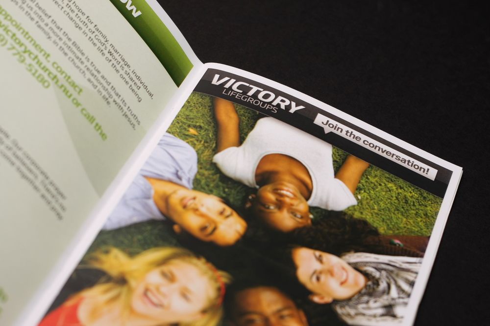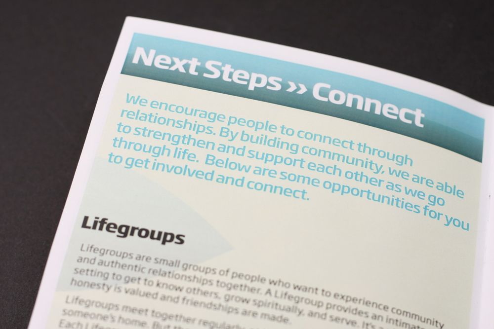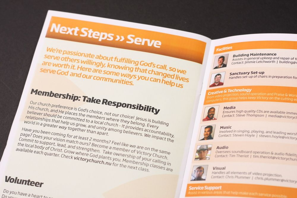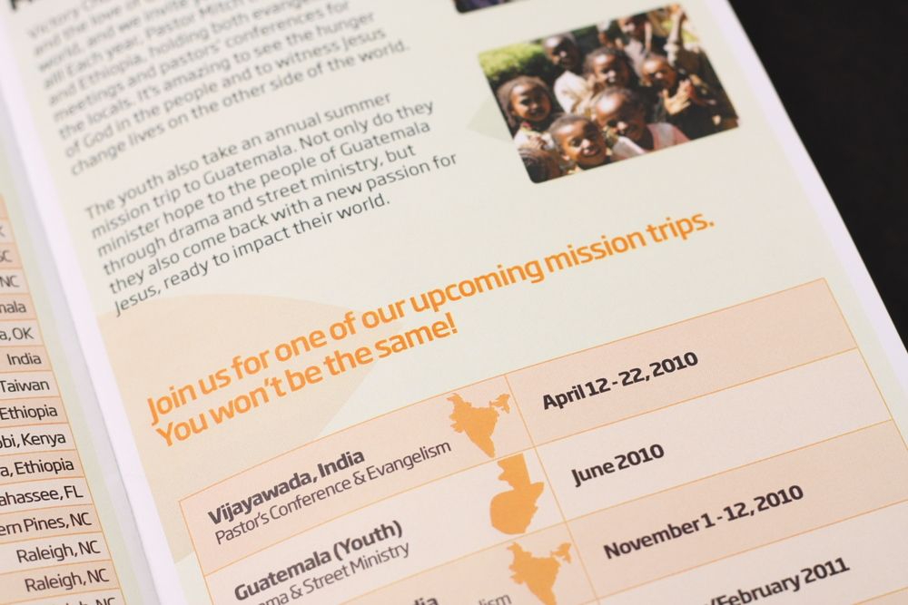
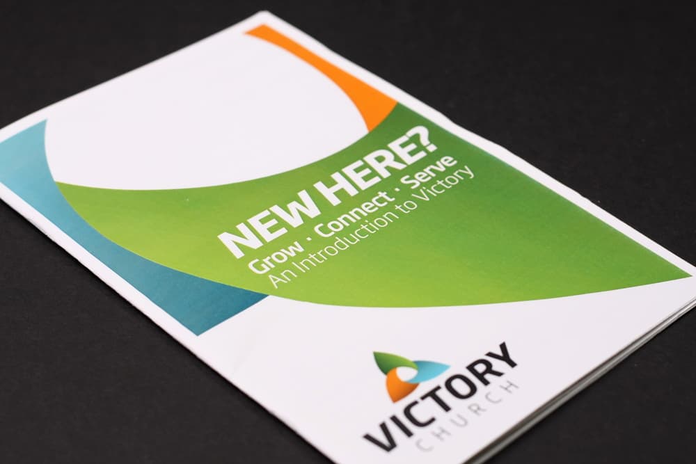
For the design, I wanted to go with the theme of the new identity. I focused on using the three main colors found in the logo, and set all of the type in Soho Gothic. This helped keep the entire brochure consistent.
Ending up at 20 pages, the brochure probably contained too much information, but that area was out of my hands. Overall, I believe the New Here Brochure will give anyone an in-depth look at what goes on at Victory Church.